This photograph was taken by Paolo Pellegrin in 2010. I like this photo because of the use of the rule of thirds. The subject is in the lower third which brings the viewers attention there, but also leaves a lot of open space at the top, which is beautiful because you can faintly see the mountains in the background. I also like the picture because the photographer was able to capture the ripple affect of the water which is very cool.
http://photography.nationalgeographic.com/photography/photos/best-pod-march-2010/#dead-sea-swim_13603_600x450.jpg
Saturday, May 22, 2010
Boxing Study 1397 Manny Pacquiao
This photograph was taken by Howard Schatz in 2010. I like this picture because of the tone it sets. By the subject's facial expression and by the water going everwhere randomly, it sets a tone of fierceness. I really like how the photographer caught the sweat or water drops in the air. I also like how clear this photo is and how it shows off the human body. This is one of my favorite photos because of the position the subject is in along with the sweat coming off of him.
http://www.howardschatz.com/portfolio.php?galleryID=44
Warriors, Papua New Ghinea
This photograph was taken by Lisa Kristine. I like this photograph because the photographer takes a picture of a line of warriors but she only put the closest person in focus so the viewers attention is drawn more to him. I also like clarity of this photo along with how the photographer decided to only take a picture of the face of the warrior instead of his whole body.
http://lisakristine.com/images/order.html
Unintended Light
This photograph was taken by Zoltán Vancsó in 2007. It is a picture of Tunisian umbrellas and their shadows. I really like this picture because of the shadows on the beach. The light is coming from somewhere on the left and the shadows of the umbrellas are very define. I also like how the shadows of the umbrella are circular when the umbrellas are a cone shape, it is very interseting. I also like how the picture is in black and white only.
http://www.lensculture.com/vancso.html?thisPic=20
The Woodstock Stage
This photograph was taken by Jim Marshall in 1969. It is a picture of the stage at Woodstock. I like this photo because it shows how huge the crowd was at the Woodstock festival. I also like how he is taking the picture from behind the stage looking at the audience because it gives a different perspective on the event, so instead of everyone looking up at the stage, we are looking down at the audience. I also like the sepain tone to the photograph.
http://www.marshallphoto.com/collection/detail/image/1158
Waikawau Bay
This photograph was taken by Steve Burling. It is a photo of Waikawau Bay in Coromandel, New Zealand. I like this photograph because of the mirror image that the water projects. You can see the mountains and the clouds in the water so it is almost as if you could turn the picture upside down and you wouldn't notice a change. I also like how the photographer put the shoreline in the middle third so the photograph is half actual image and half mirror image.
http://photography.nationalgeographic.com/photography/photos/best-pod-april-2010/#waikawau-bay-new-zealand_17620_600x450.jpg
Thursday, May 6, 2010
Iguaçu Falls
This photograph was taken by Frans Lanting on April 25, 2010. It is a picture of the Iguaçu Falls, which a wealth of water—up to 1.6 million gallons (6.1 million liters) a second—pours over the Iguaçu Falls on the border of Brazil and Argentina. I like this picture because of it beauty. I also like this photo because the photographer uses the rules of thirds. He places the waterfalls on the left side of the picture and the top of the falls lie on the top third. I also liked how the photographer took a close-up of the falls and has the falls in the background as well.
Tuesday, May 4, 2010
The Quiet American
This photograph was taken in 1958 by Pete Turner. I like this pciture because of the color. Even though it was winter and it was snowing, the photographer makes his photograph have a blueish tone to it, so it makes the picture seem cold and lonely. The tone of the color goes good with the theme of this picture, which is lonely and quiet. I also like how the photographer took the picture with only one car in it, so it seems as if everyone is missing or something. The photographer also used the rules of thirds.
http://www.peteturner.com/
Wednesday, April 28, 2010
Blue Iceberg
This photograph was taken by Maria Stenzel near Candlemas Island in the South Sandwich Islands. I like this photo because of the color of the icebergs and how they contrast to the sky above them and also to the water below them. I like how the photographer didn't zoom in all the way on just the iceberg so the viewer could see the contrasting colors. I also like the penguins, because they're awesome.
http://photography.nationalgeographic.com/photography/photos/extreme-earth/#blue-iceberg_10489_600x450.jpg
Married Couple
This photograph was taken by Elliott Erwitt in 1955. I like this photograph because of the frame. The car door and the window of the car frame the couple kissing. I like how the photographer used angles to get the perfect shot through the window and the newly weds. I also like how the car door is out of focus so it puts more emphasis on the couple kissing.
http://www.magnumphotos.com/Archive/C.aspx?VP3=ViewBox_VPage&VBID=2K1HZS2U5HCO&IT=ZoomImage01_VForm&IID=2S5RYDZIM9GB&ALID=2K7O3R14CQ3W&PN=42&CT=Search
Thursday, April 22, 2010
Midtown Manhattan
This photograph was taken by Thomas Michael Alleman in December of 2004. I like this photograph because of the reflection of the sign on the hood of the Mercedes. The car is used as a mirror to show the "bright lights" of the New York. I also like how the people in the background are blurred like they are in motion but the car is not blurred so it loooks like the car is not wrapped up in the fast speed of normalcy. I also like how the picture is in black and white so the color does not distract the viewer from the focus of the photograph.
http://afterimage.com/allemanmercedes.htm
Wednesday, April 21, 2010
This photograph was taken by Kathryn Swihart in 2009. I like this photo because of the white smoke on the black background. Since the background is black, it bring the smoke to life and the smoke becomes the focus of the picture. I also like how the smoke is changing form from the match into the air. This is a very cool picture that shows the mystery of randomness of smoke.
http://kathrynswihart.carbonmade.com/projects/2564339
Friday, April 16, 2010
Fitzgerald Perserve
This photograph was taken by Diane Kaye. I really like this pictuer because of the light shining through the trees. The photographer placed the camera perfect in order to show the light coming down from through the trees. I also like how the picture is in black and white so the loght rays show up better and are the center of attention
http://www.dianekaye.com/photo_3471206.html
Frank Gehry’s Schnabel house
This photograph was taken by Tim Street-Porter on March 9, 2010. I like this picture because of the colors. They are very vibrant and I like how the sky changes blues from top to bottom. The shadows are also very cool. I like how he shadows of the trees on the side of the wall are shown but the actual trees are not. I also like the shadows on the globe and white building on the right.
http://www.popphoto.com/content/architectural-photographer-tim-street-porter?pnid=64436
Tuesday, April 6, 2010
Wyre Wreck
This photograph was taken by David J. Nightingale in 2003. I really like this photo because of its color. The photographer used the light to make different colors in his photo. The orange varies throughout the picture with the brightness and darkness. I also like how vibrant the color is beacuse it just invites the viewer into the picture. I really like the clarity of this photo and how you can see even the cracks in the ground. But most importantly, I just enjoy the wonderful beauty of the photograph.
http://www.chromasia.com/galleries/0906220908.php
City Lights: Paris & Rome
This photograph was taken by Sil Azevedo. It is an interesting picture of the Eiffel Tower in Paris, France. I like how the photographer is right under the tower and shoots up toward the top of the tower. I also like how he places himself mmore towards one side of the tower, so the photographer gets a leg of the tower and also the more renowned top of the tower. The perspective and angle of this photograph is amazing and it creates a sense of how large and great this piece of architecture is.
http://www.themomentofseeing.com/Site/Galleries/Pages/Europe.html#0
Wednesday, March 31, 2010
Beach Fence
This photograph was taken by Alan Klug. I like this photograph because it is in a sepian tone and it's very subtle. I also like how cool the fence looks in the sand. I really like how the photographer shows the ocean and the sky but keeps it the same color as the sand. The sand is untouched and perfect coming up against the fence. I also like how the photographer splits the photograph in two by the fence. On the left side is the ocean and calmness, but on the right side there is grass and it's alive with business.
http://alanklugphotography.com/gallery-pages/domestic/h-1049.html
Smoke Beauty
This photograph taken by Jeff Stephens is one of many photos in his portfolio called "New Work". I like this picture because it gives the sense of mystery and darkness in it. The smoke around the person makes it seem like the subject is hiding something. I like how viewers have to keep looking at the photograph because of its mystery. I also like how the photographer put a black background behind the subject with black clothing on. This picture is very interesting and shows how serious the photographer wanted the mood to be.
http://www.jeffstephens.com/
Monday, March 22, 2010
Billy
Joey Lawrence took this photograph of Billy from the band Silverstein in 2009. I like this picture because of its clarity and quality. I also like how it is a close up portrait and how the photographer chose to not show the outside of the car. I also like how the photographer used the rule of thirds. The subject is located in the right third of the photo but your eye is drawn to his hand on the steering wheel which is in the left third.
http://www.joeyl.com/
Mountain Mirror
This photograph was taken on July 31, 2007 by German, Pham Nuwem. It is a picture of a mountain range with a lake beneath it. The water is so clear that it actually relflects what is above it: mountains, rocks, a person, and a shack. I like this photograph because it shows the beauty of nature once again. I also like how the photographer uses reflection by positioning the camera so the water reflects the mountain range. It shows how a simple photograph can be turned into something amazing. I like the colors of this photo also, beacuase they are very vibrant and bright.
http://www.dpreview.com/challenges/Entry.aspx?ID=191777&View=Results&Rows=4
Thursday, March 11, 2010
Lightning at Huntington Beach, Ohio
This Photograph by James Larkin was taken in April of 2009. It is a picture of lightning stricking at a beach. I like this photo because of its sheer beauty and how gorgeous the water and the sky is. The color contrast between the sky and the water is remarkable. I also like how the photographer uses the rule of thirds by putting the sky in the upper two thirds and the water and th beach in the lower third. The actual lightning strike is taking place not in the middle, but in the right third. I really like this photo because it shows just how beautiful nature can be.
Tuesday, March 9, 2010
Owachomo Bridge at Night, Utah
This picture of the Natural Bridges National Monument was taken by Jim Richardson. This is just one photograph in his gallery called Light Pollution: Our Vanishing Night. In his gallery, he shows the brillance of natural star light and the negative effect of man-made light. I like this picture because Richardson does a wonderful job of framing. He uses the rock formation to frame out part of the sky and its stars. I also like how he used light to emphasize the beauty of the rock formation. The light is coming from beneath to eluminate the bridge. He also uses the rule of thirds by having the horizon line at the bottom third, which thus puts more emphasis on the stary night sky.
http://www.jimrichardsonphotography.com/ or http://photography.nationalgeographic.com/photography/photo-of-the-day/owachomo-bridge-pod/
Monday, March 8, 2010
Algerian acrobat Salim inverted in the desert outside of Dubai
This photograph taken by Chase Jarvis portrays a man jumping through the air in a desert scene. I like this photograph because of the light. The sun is up top in the middle and creates great shadows on the sand and on the man. Also, this photo is very clear and vibrant which attracts viewers like myself. Jarvis uses the rule of thirds very well in this photograph. The horizon line is at the bottom third with the sky above it and the desert below. By doing this the focus is more on the sky rather than sand. The sky and the clouds are very beautiful is this picture. He also uses the rule of thirds by placing the jumping man in the top right quadrent. The viewers eye is immediately drawn to him.
http://www.chasejarvis.com/#mi=1&pt=0&pi=2&s=0&p=-1&a=0&at=0
Thursday, March 4, 2010
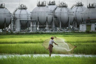
Former Society vs Modern Society
Steve McCurry took this photograph in 1994. It is a picture of a native fisherman fishing in a creek with a modern oil refinary in the background. I like this picture because it shows two sides of life: the serenity of nature and the exploitation of modern business in our society. I like how the photographer positioned the man so it looks like the oil refinary is bigger than the man. It shows how our modern society puts business and money before individuals and their work. Also, McCurry breaks the rule of thirds by spliting the photo into two halves: one for the mdoern oil refinary and the other for the natural green area. By doing this, he contrasts the picture equally between the two societies of life. I also like how Steve McCurry uses color to dipict the two sides of society. The top half is almost dull and colorless while the lower half is brightly colored.
http://www.magnumphotos.com/Archive/C.aspx?VP3=ViewBox_VPage&IT=ZoomImage01_VForm&IID=2K7O3RTT8PLC&ALID=2K7O3RTT5VOS&PN=41&CT=Search
Subscribe to:
Posts (Atom)